Lorenzo is a graphic designer and illustrator with a focus in the music industry and large scale events. Lorenzo currently works with JJLA Entertainment Agency.
PROJECTS
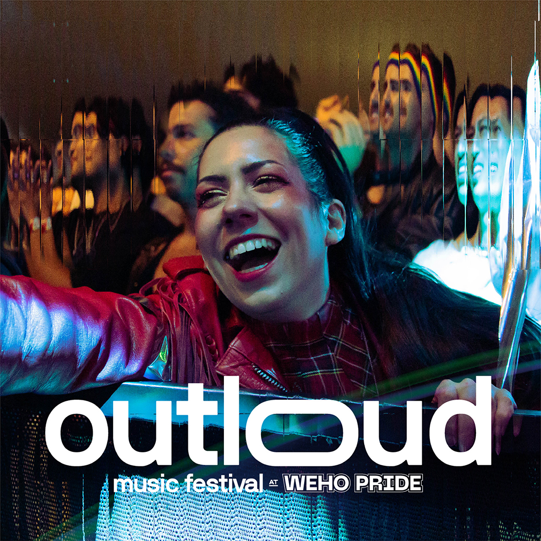
OUTLOUD Music Festival
Brand Design / Event Design
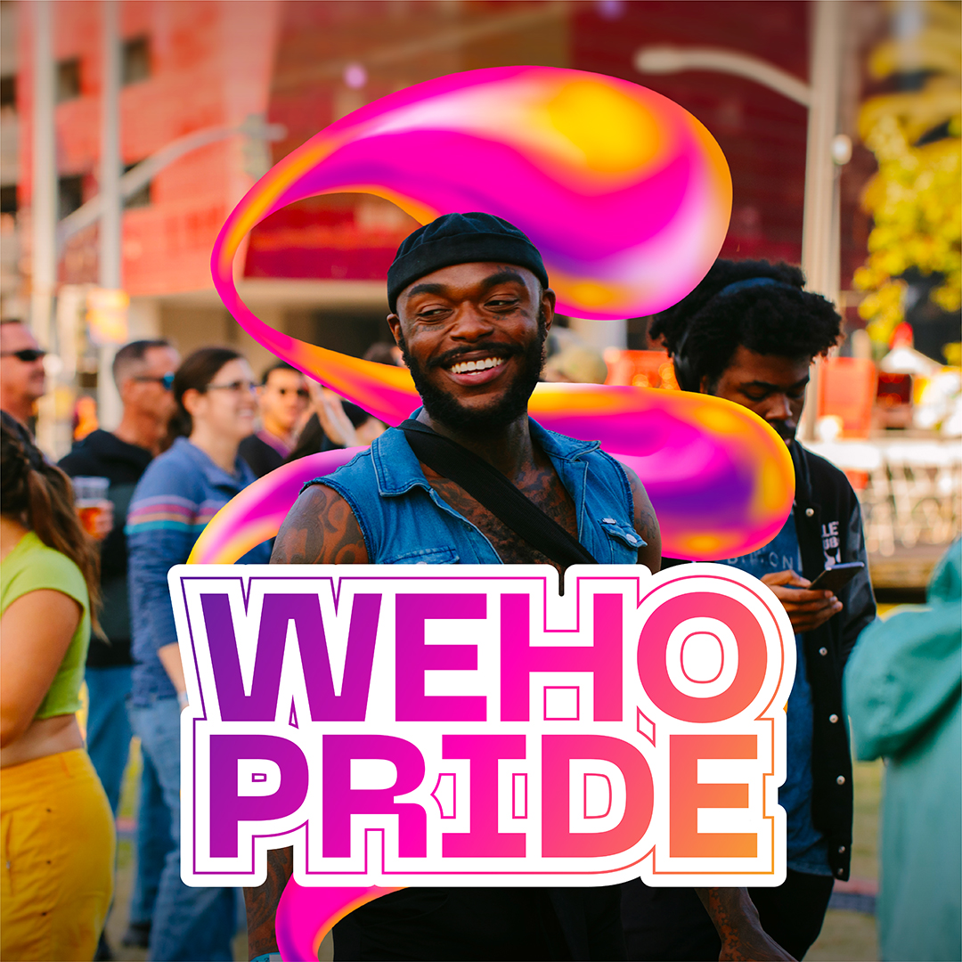
WeHo Pride Festival
Brand Development / Event Design
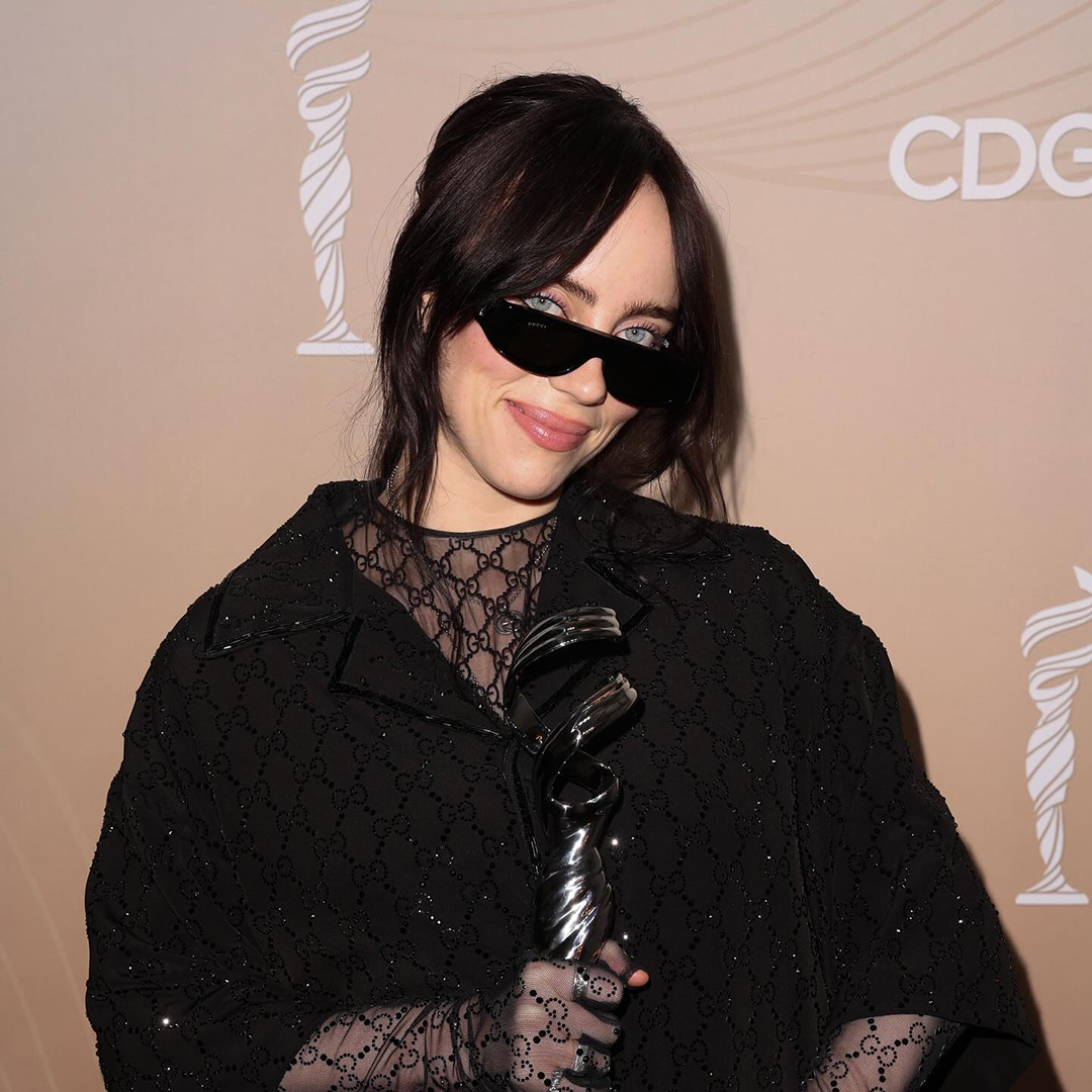
Costume Design Guild Awards
Brand Development / Event Design
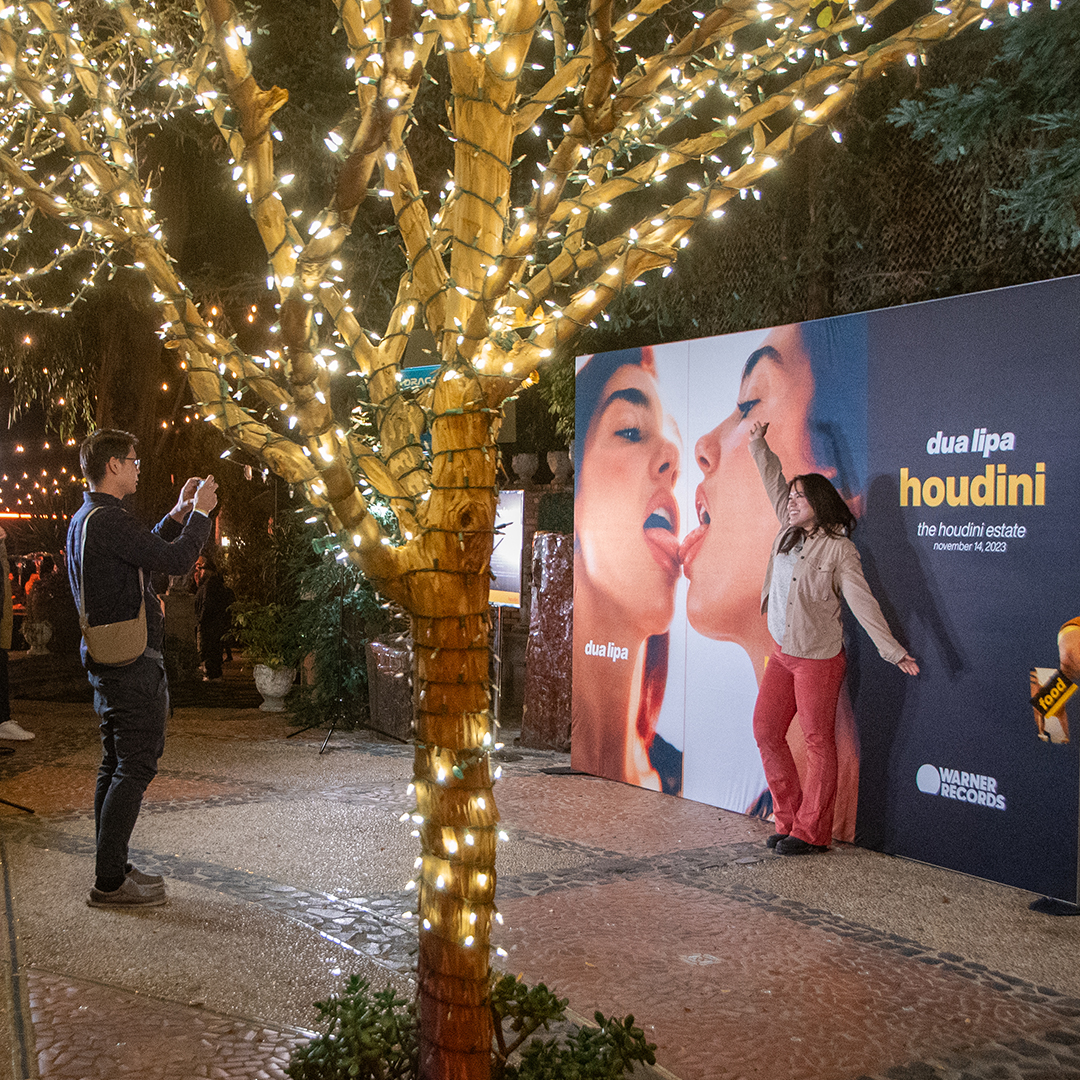
Dua Lipa – Release Party
Brand Development / Event Design
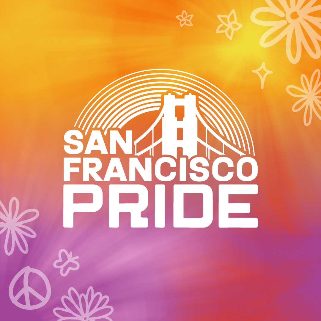
San Francisco Pride Festival
Brand Development / Event Design
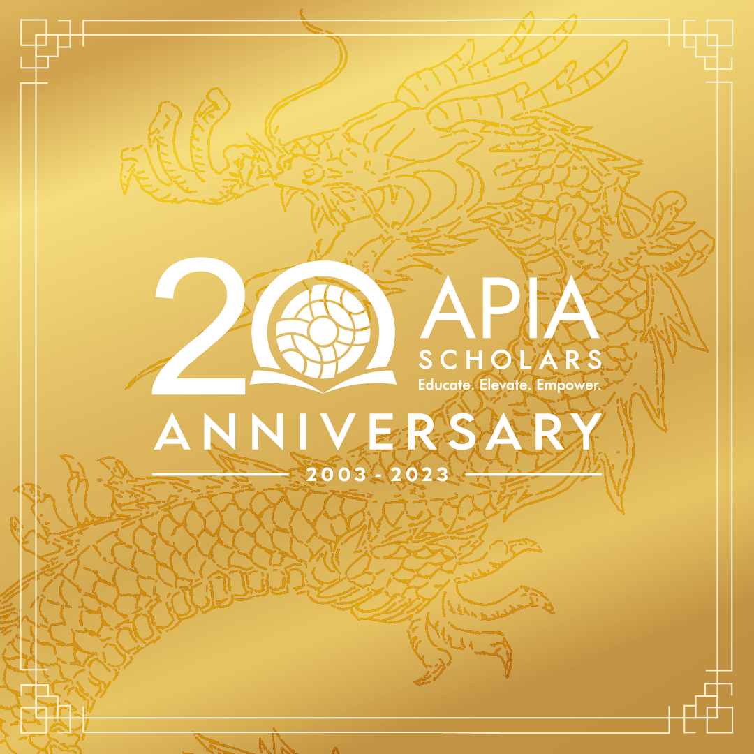
APIA Scholars
Brand Development / Event Design
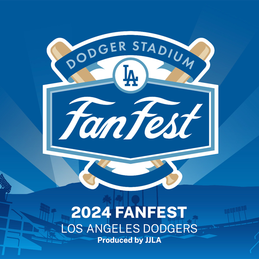
Major League Baseball
Deck Design / Event Design